Client: Arcadia Inc., St Petersburg, Russia
Scope: Logo design, event brand identity, participant collateral, signage, print materials
Role: Sole designer — concept through production, across all editions
Duration: Multiple editions, 2015–2021
The Brief
The Azov Developers Meetup (ADM) was an annual software development conference organised by Arcadia Inc. in Taganrog, bringing together developers, engineers, and technology professionals from the region. As the in-house marketing designer at Arcadia, I was responsible for the complete visual identity of the event from its inaugural edition in 2015 — designing the logo, producing all print and digital materials, and supervising printing and on-site production in Taganrog across every edition.
Identity
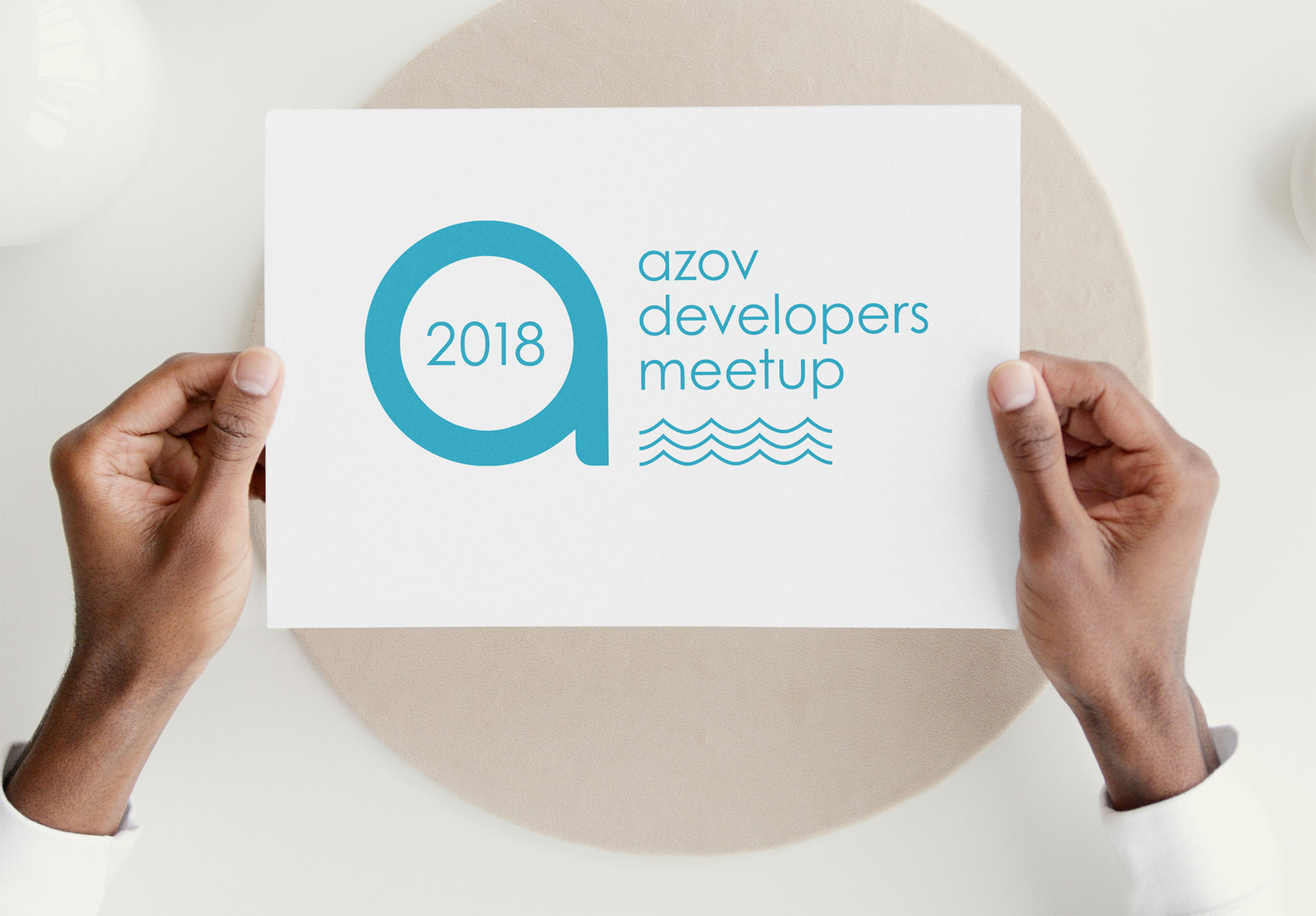
The original mark, introduced in 2015, derived its central device from the A letterform in Arcadia’s existing logo — redrawn and set within a circular frame with the event name in a clean sans-serif. The approach created a deliberate visual link between the event and its organiser while giving ADM a self-contained identity that could stand independently on-site and in communications. The palette was built around Arcadia’s institutional teal, reinforcing that relationship without subordinating the event brand to the corporate one.

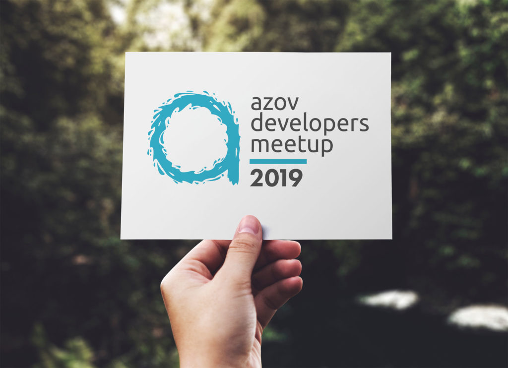
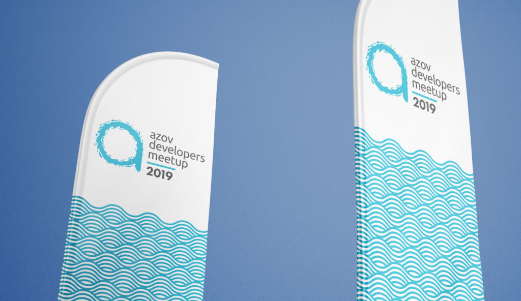
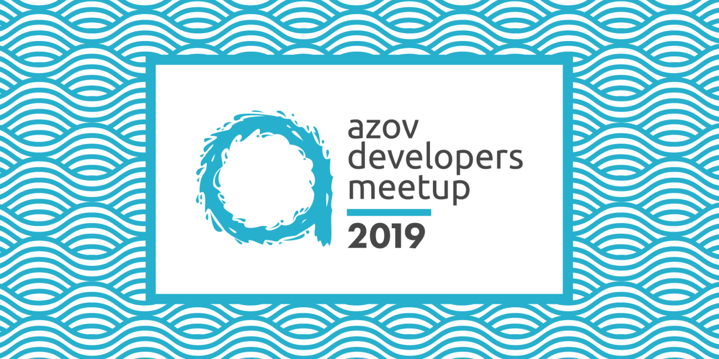
After four editions, I initiated a visual refresh for 2019. The updated mark retained the Q device and teal palette for continuity but tightened the geometry, refined the typography, and introduced a more confident lockup. The refresh was driven by a straightforward design judgment: the original mark had served its purpose but had scope to be sharper.

Collateral System
Deliverables across editions included:
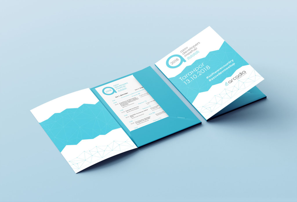
Participant folder — A gatefold folder carrying the event identity on the cover, with the geometric teal/white pattern system on the interior panels and a pocket for loose inserts. Produced for the 2018 edition with the original mark.
Programme insert — A separate printed programme sheet for earlier editions, designed to sit inside the participant folder. Two-column layout organising parallel tracks by time, with typographic hierarchy distinguishing session titles, speaker names, and time markers.

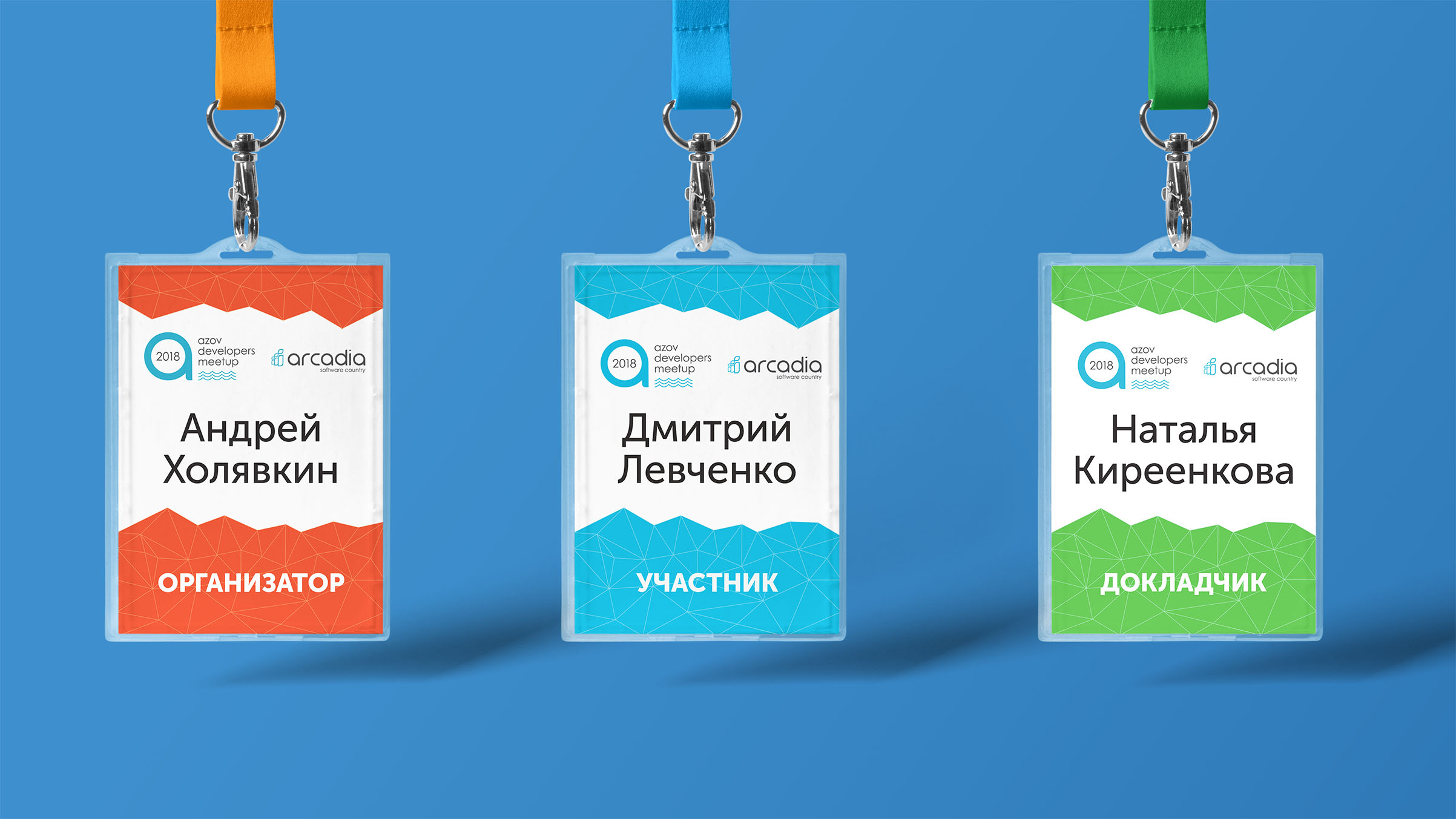
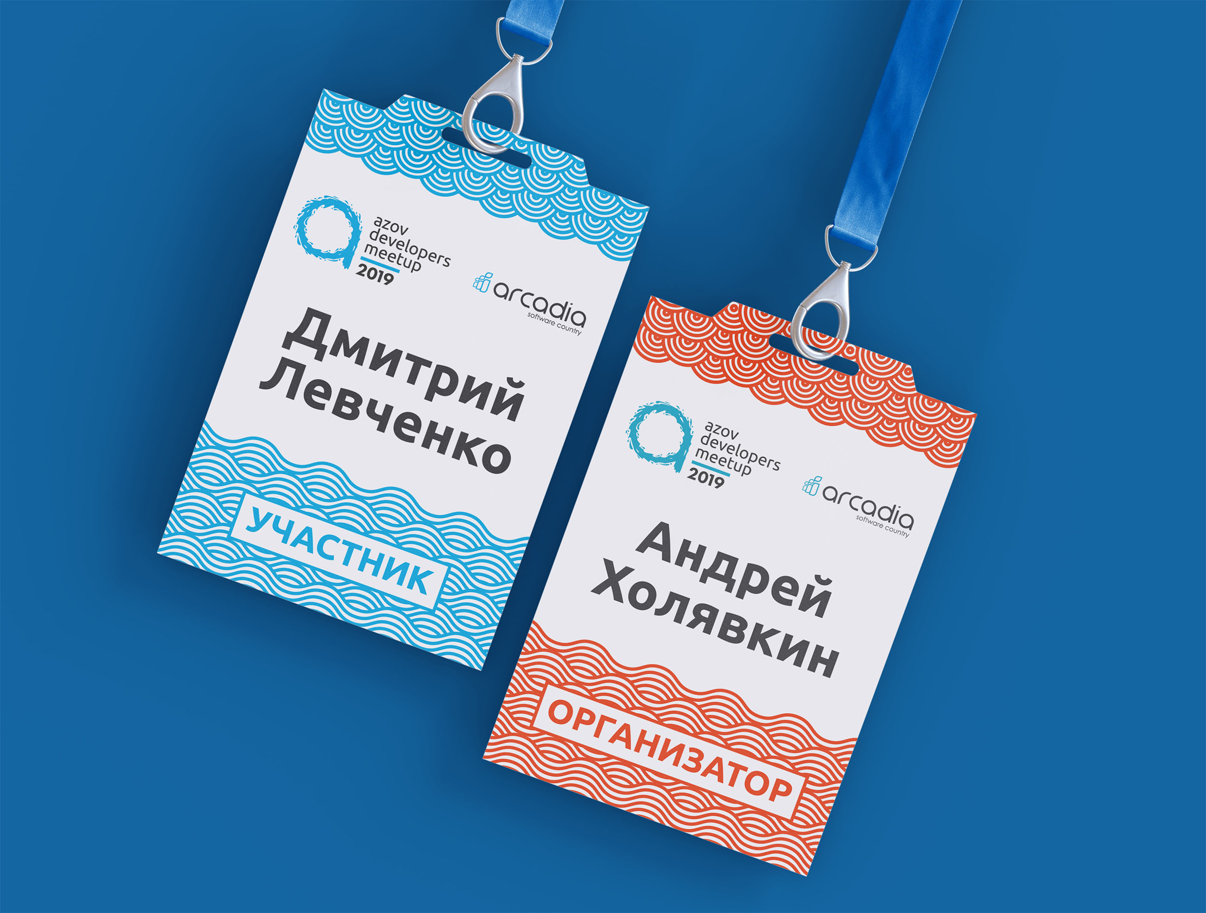
Badge with programme reverse — From 2019, the printed programme was consolidated onto the reverse of the delegate badge — reducing print complexity and giving attendees a single object that served both functions throughout the day. The front carried the personalised delegate information and event identity; the reverse carried the full day schedule.


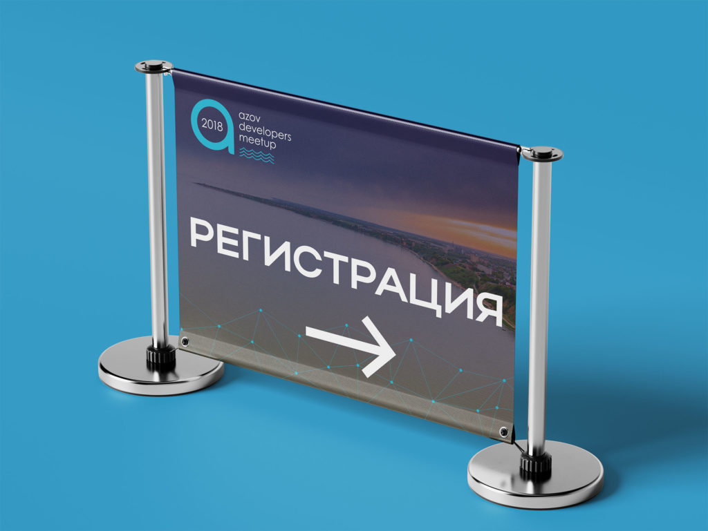
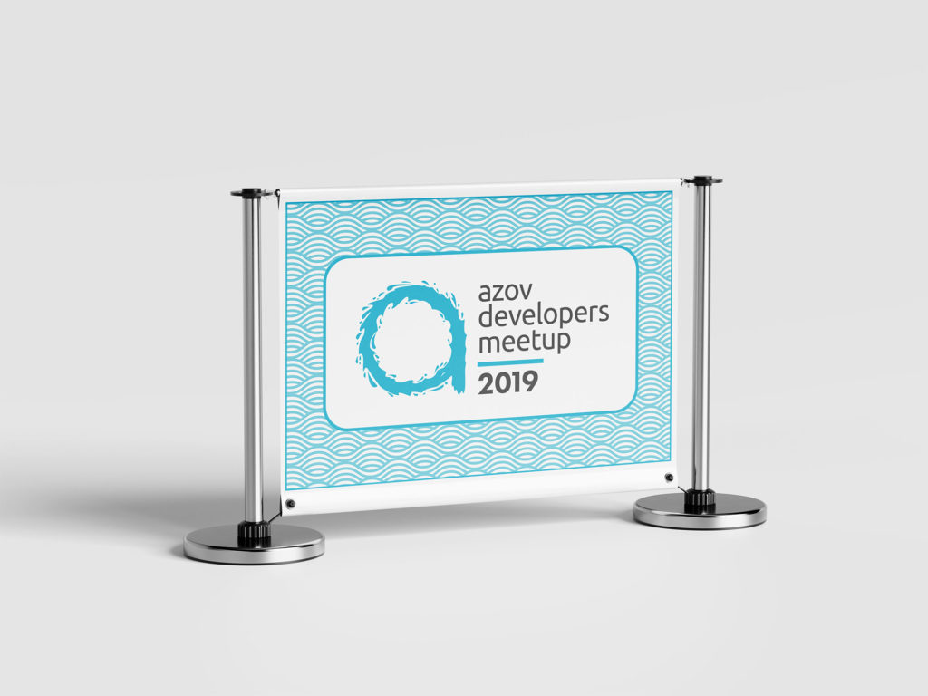
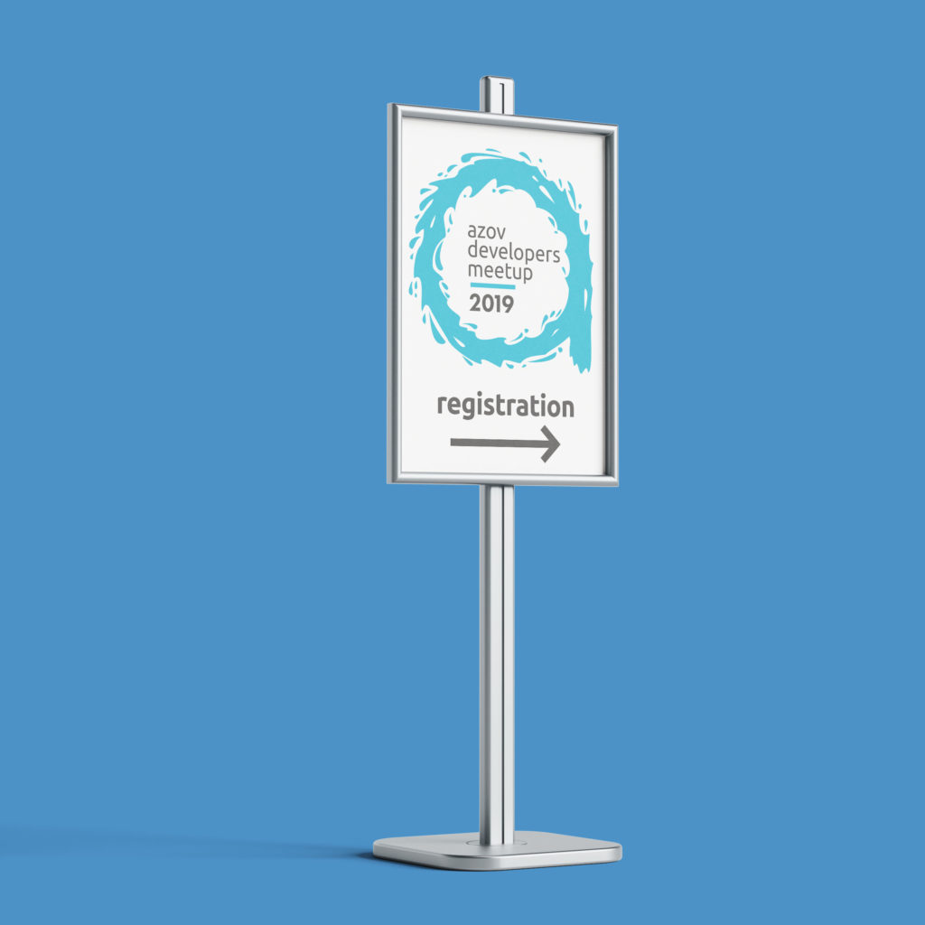
Wayfinding and navigational signage — A system of on-site signs produced for each edition, covering the main entrance, hall identification, guest registration, coffee area, and other event touchpoints. Designed to carry the event identity consistently across all physical spaces.


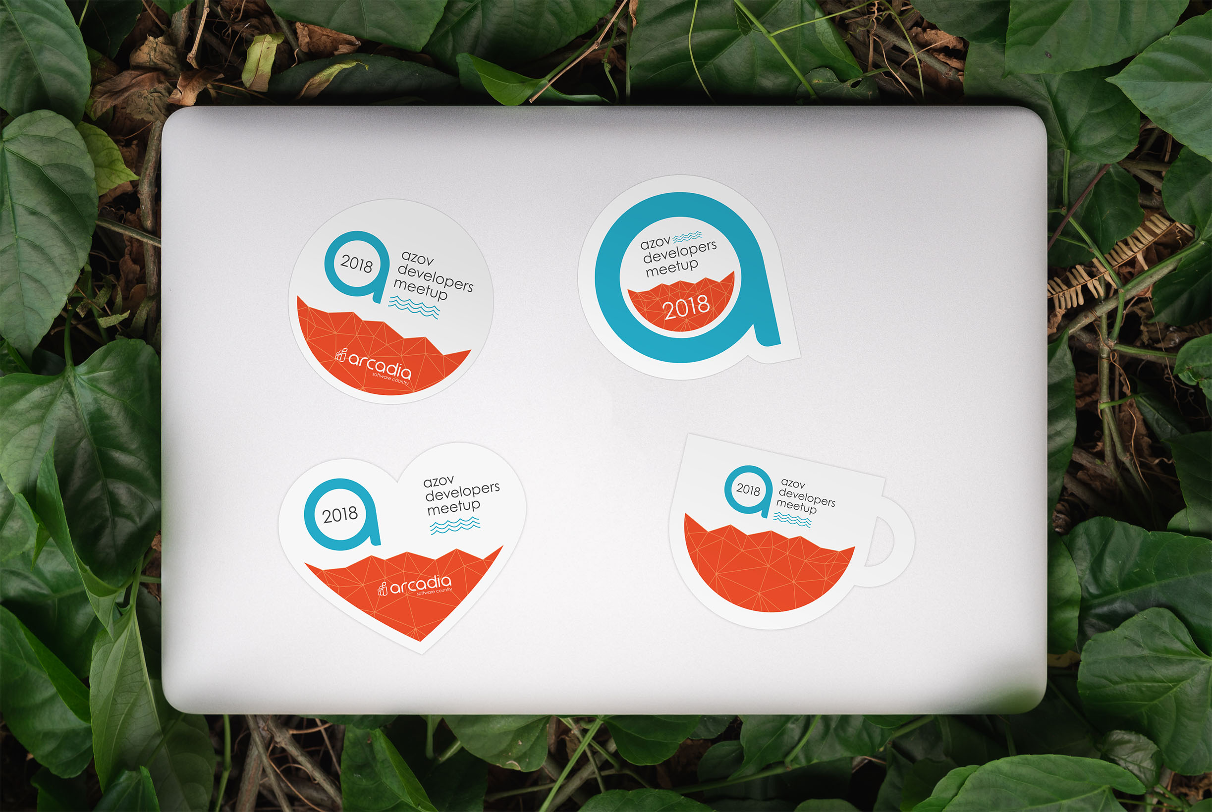
Stickers — Event stickers produced as takeaway collateral.

Outcome
The ADM ran across multiple editions between 2015 and 2021, with consistent visual identity throughout. The event grew over that period while maintaining a coherent brand — the 2019 refresh marked a deliberate evolution rather than a break, preserving recognisability for returning attendees while lifting the visual quality for a maturing event.